To view feedback from your student surveys, you must first mark the survey as complete and close it to further responses.
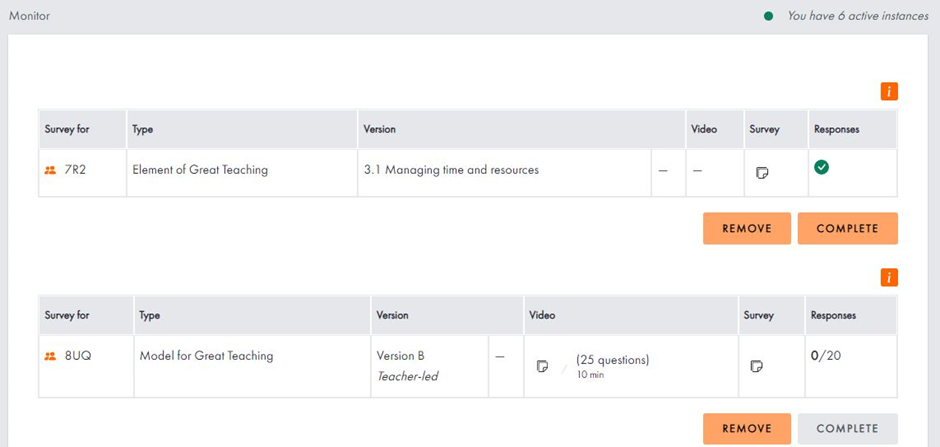
You can check how many students have completed your open student surveys in the “Monitor” section of your “Student survey” page. Once the expected number of responses has been reached, you’ll see a green tick appear in the “Responses” column. However, even if you do not reach the expected number, you can click “Complete” to close the survey and view your feedback as long as 5 or more students have completed the survey.
The screengrab below shows one survey ready to complete (top, see the green tick in the responses column) and a second survey with no student responses at present.
Once you have completed a survey, you can view your feedback by clicking the “Feedback” subitem under "Student surveys" in your menu. On this page, select the time frame you want to look at surveys from by using the dropdown (e.g. 2021/22). The table below will then show all your completed surveys from that period. You can select which survey you want to view feedback from by ticking the relevant box in the right-hand column. You can select up to four surveys at a time, allowing you to compare the results of different classes, or create a profile across all four Dimensions, even if you surveyed these separately.
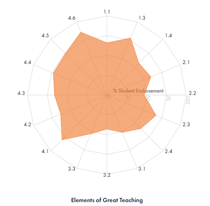
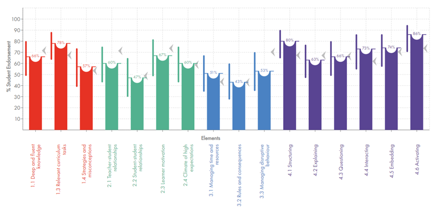
If viewing the Model for Great Teaching survey of all four Dimensions, your data will appear below as both a radar plot and a bar chart broken down by each Element. You can use the toggles above the charts to switch classes on or off, allowing you to create overlays for different classes. You can read more about how the data is presented by clicking where it says “Understanding your data” above each bar chart or by scrolling to the bottom of this article.
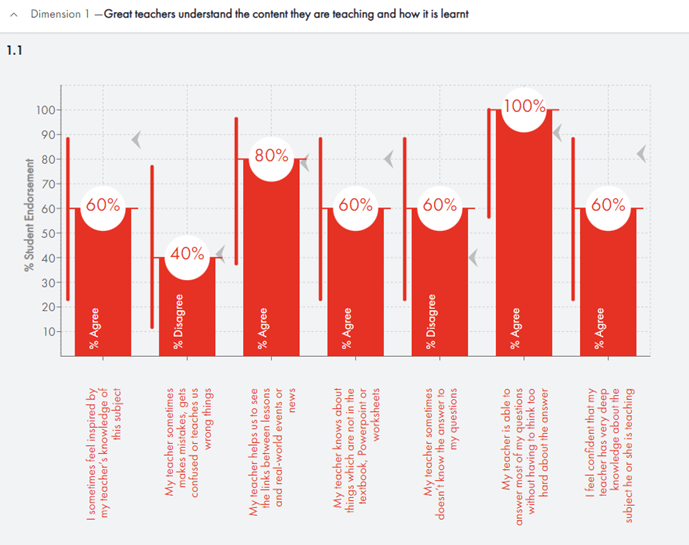
The following examples show feedback from the Model for Great Teaching survey from one class as you scroll down the page.
Radar plot of all Elements
Breakdown of the radar plot by Element
Breakdown by question (available for each Element)
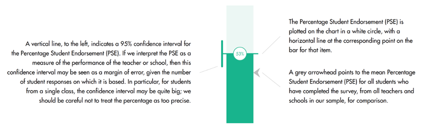
The image below explains how the data in our bar charts are presented.